Amazon Mobile Homepage
Creating a personalized gateway for customers
Role: UX Lead Team: Product, Engineering, Content, Research
Overview
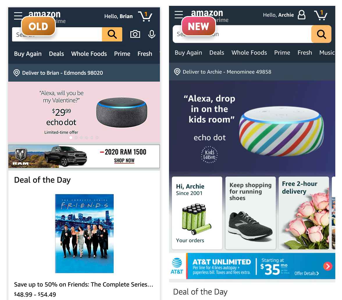
The Amazon mobile homepage was uninspiring and overwhelming. Through research, we learned customers want to be welcomed to an inspiring shopping experience specifically tailored to their needs. Instead, the homepage was one-size-fits-all, showing the same deal and hero banner to every single customer. We had an opportunity to showcase a more delightful, customized experience for every customer.
Redesign Goals
- Create a delightful and inspiring first-launch experience
- Bring personalized content to the top of the homepage
- Introduce more variety in content
Process & Experimentation
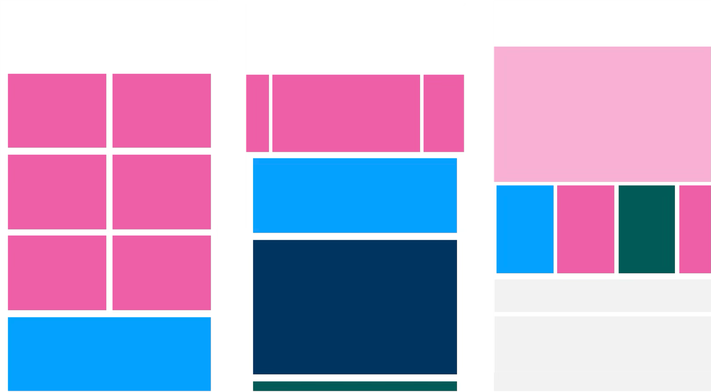
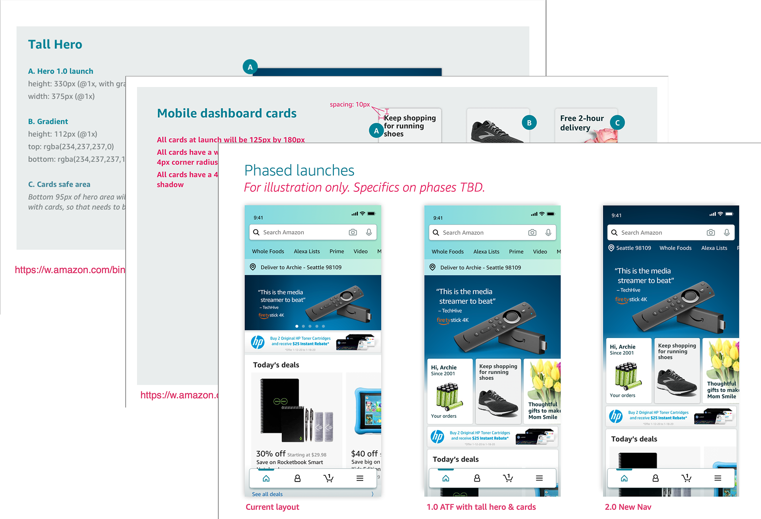
Starting with the hero, I deconstructed the top of the homepage to rethink how we greet the customer. This space was underperforming, yet had enormous potential for impact.
I sketched out different layouts for the hero section:
- Multiple small heroes
- A smaller hero area with shopping content below
- A large hero with a scrollable card section
New Paradigms
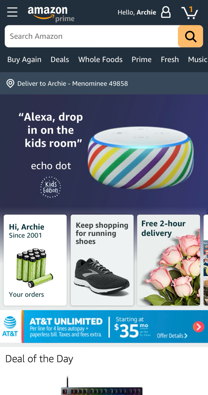
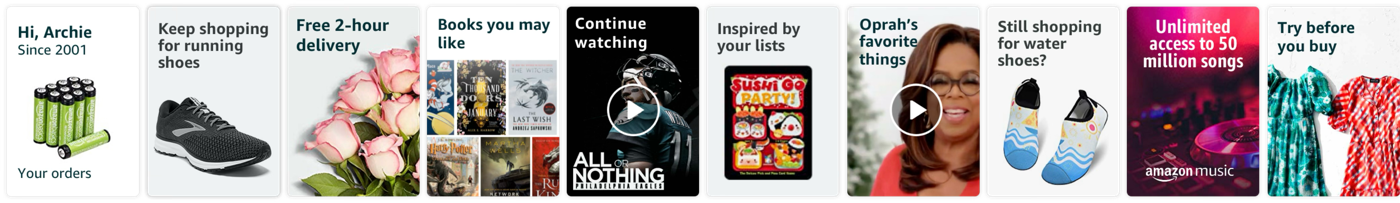
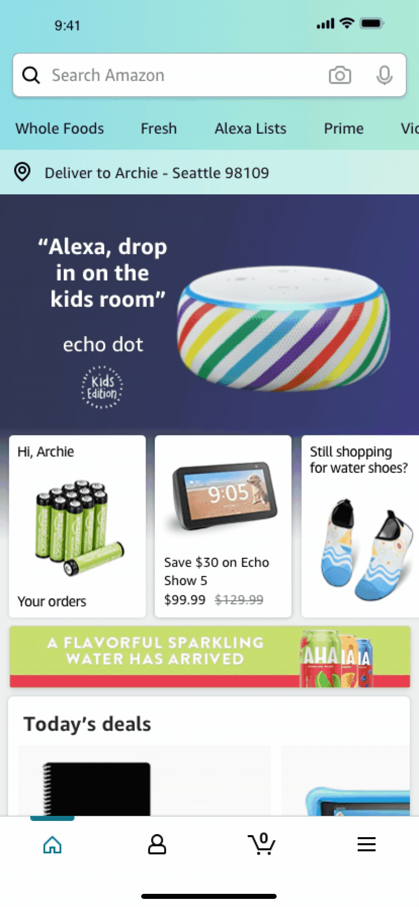
As I experimented with each of these ideas, the design that most closely aligned with our goals was one that introduced a taller static hero with a set of horizontally scrollable cards—some personalized, some static.
I applied various campaigns and recommendation strategies to these cards to see how they would fit as I prepared to meet with internal stakeholders across Amazon.
Roadshow & Testing
I worked with teams around Amazon to both roadshow this idea and start to build consensus around it, and any standards that we’d need to update. These teams included Amazon Devices, Prime Video, Music, Kindle, Deals, Advertising, Holiday Events, Prime Day, Fashion, Personalization, and more.
I developed standards for the teams creating content strategies and assets for the homepage as this presented a pretty significant shift.
Lessons Learned from Experimentation
We ran qualitative and quantitative tests with customers, too. This feedback helped immensely as I developed a design framework that was built to last.
- Users engaged naturally with both the hero and scrollable cards
- Personalized cards performed best
- Multiple slides in the hero were still needed for internal scheduling and testing
Launch
The new homepage launched globally in 2021. We saw significant improvements across key metrics—interactions, engagement, shopping behavior, and revenue—while meeting customer and internal team goals.