.net Magazine Article: On Web Typography
Jun 04, 2013
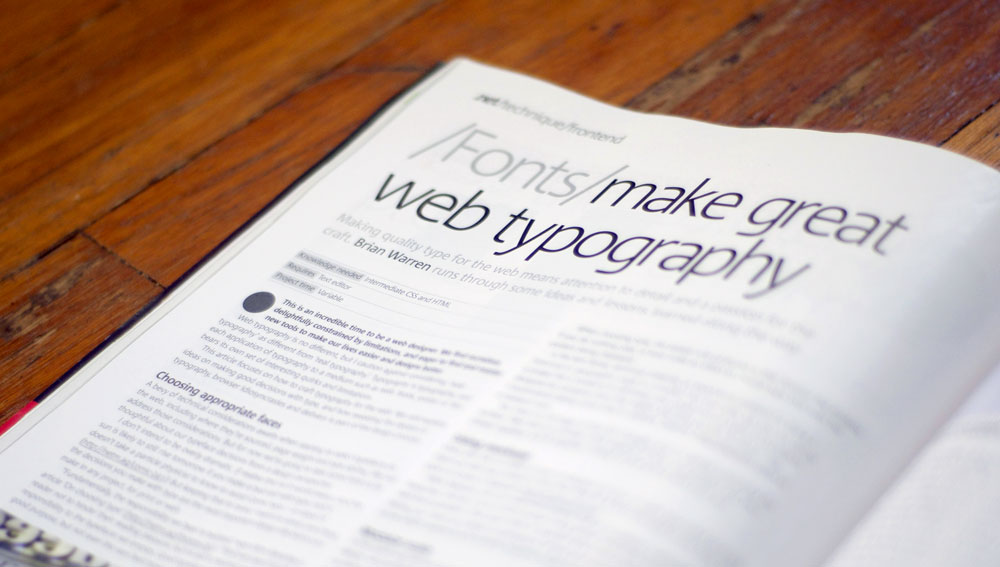
This spring I had the pleasure of writing an article for .net Magazine on one of my favorite topics, web typography. The article covers several ways you can take your type on the web from good to great by sweating the details. These details include simple things such as choosing an appropriate face for a project, or more fun and complex ideas such as using modular scale and tinkering with font-feature settings.
I had a blast writing the article. It involved at least a couple weeks of getting up at dawn to make some coffee and write (much like I’m doing right now). By far the most painful part was chopping the article down to size. There were a few harrowing days when I was several hundred words over my limit.
I’ll post again when the article is available on the .net website, but that may be awhile. I suggest finding a newsstand to pick it up. Look for it in the June 2013 issue. No newsstand near you? Not to worry, you can order it directly, and you can even pick it up on the iPad (how convenient!).