Building Cognition
Feb 01, 2011
One thing I can say about my work over the past year at Happy Cog is that every project has brought something new and interesting to the table.
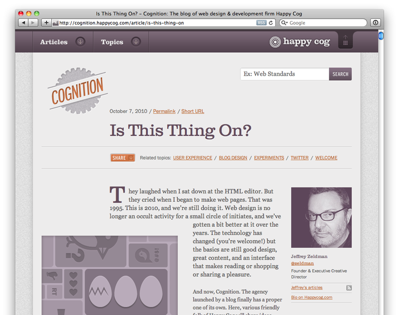
I remember the first time I saw some of Chris Cashdollar’s early designs for Happy Cog’s blog, Cognition, and I thought “I really want take this design and build it.” I’m not sure what it was. Something about the unusual color palate and the gorgeous typography. It just pushed all the right buttons for me. So when the design phase started wrapping up, I was pleased to see I had some extra time on my plate to take this project on.
There were two areas of this project where I got to really play around: Web Fonts and Responsive Design.
Web Fonts
The design for Cognition didn’t come out of a vacuum. We’d been working on getting a unified style for all of our documents: Everything from contracts to keynote presentations. This effort, spearheaded by the brilliant Kevin Sharon, resulted in using Jenson, Sentinel, and Franklin Gothic our house typefaces. We used Typekit and Fontspring for our type on the web, with Adobe Jenson Pro and Franklin Gothic. Sadly, no Sentinel for now, so Clarendon had to play stand-in.
Originally we went crazy with these, using lots of weights (of Franklin, especially). It was so fun seeing all this gorgeous type on the screen. The danger, of course, is that if you use five different weights of Franklin, you’re asking the user to download all five of those fonts. In the end, we consolidated our choices in the weights a bit and were able to get the page a bit more trim.
Using web fonts on this project was a wonderful, liberating experience. From a technical standpoint, it was a bit fidgety, though. Browsers are still figuring out how to deal with them and it requires a bit more tinkering than it seems like it should. Nonetheless, I’m loving using web fonts.
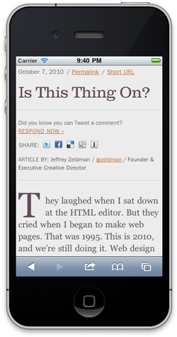
Being Responsive
The other area of play was making the Cognition design responsive. Responsive design is an approach to web design to try to make your site flexible and appropriate to the viewing device. The end result is that nice wide screens get a more open, wide layout, and narrow screens and smaller devices get a more focused experience. For a much more interesting read on responsive design, check out my friend Ethan Marcotte’s A List Apart article where he coins the term: Responsive Web Design
Taking the Cognition design responsive was very fun. It was a wonderful learning experience, and really scratched the itch on both sides of my designer/developer brain. It offered endless opportunities to tinker, fiddle, and tweak.
Lots to Talk About
We did a lot more in Cognition than I’m taking the time to write about here. For instance, we tossed out the idea of traditional comments, favoring using twitter to aggregate responses. We also offered a way for people to blog a response on their own site and we’d call that out and link to it as well. This is also one of the few times we’ve had a site of our own to build and improve as more ideas come in and better ways to do things present themselves. It’s been very fun.
We have a publishing schedule with editors, proofers and illustrators all lined up to get an article out once a week. It’s quite a process, but it’s yielded some excellent results, like Chris Cashdollar’s article about the magic number of designs to present to a client, Ryan Irelan talking about how composting relates to code and Jenn Lukas reminding us, using her own spin on Mad Libs, that We’re All In It Together.
All of the ideas for Cognition ideas grew from lots of conversations, seemingly endless basecamp threads, and loads of collaboration from everybody on the team. That’s what I love about this job. Nobody can take all the credit for anything, because everybody can be creative in any area of the project.